White Space and Minimalism
It’s a minimalist approach that allows the text to have a stronger signal. Minimalist web designs are simple and conservative. They are basic, without clutter. The perception of the audience overrules the personal expression of the designer. This doesn’t mean that creating a minimal design requires less effort or expertise than a traditional design. Before opening up your favorite graphics app to design your hot new minimal site, you will need to establish what the site is going to be used for. Your site needs a clearly defined purpose to eliminate any confusion from the start by having a single, strong focal point.
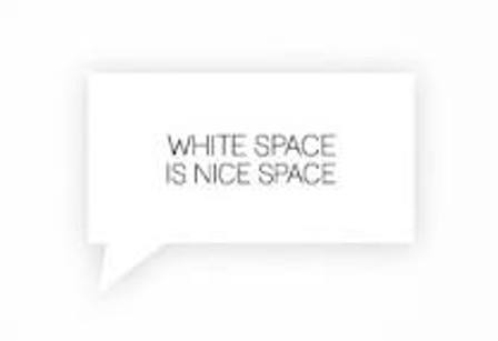
White space is an unavoidable part of design and it is implemented to varying extents under the guise of several design philosophies. Minimalist designs change all that and provide a new, friendly environment. There’s nothing else on minimalist websites except for the things that absolutely need to be there. By giving up valuable white space between elements, the site becomes cramped and elements begin to run together, not giving your eyes needed breaks which help to define separate areas.
Its purpose is to make the content stand out and be the focal point. From a visual standpoint, minimalist design is meant to be calming and to bring the mind down to the basics. If a page has too many elements, the viewer will be confused about where to look or misinterpret the priority of each element. A minimalist design puts the focus squarely on the content.
Minimalism: It Saves Time
Working with few elements and features, rather than the hundreds at your disposal, saves time. Compare this to the work of an interior designer: the more furniture there is to arrange, the more complex and time-consuming the work becomes. Your product should be clean, well arranged and spacious.
Some of the items below may not be required for your website.
- Icons or graphics for social media.
- Taglines and supplementary descriptions.
- “Featured,” “Popular” and “Recent” lists, Twitter and RSS feed lists
- Secondary navigation pages.
Minimalism: It Facilitates Learning
Scarcity brings out the best in a designer. Minimalist design stretches your imagination simply because fewer tools and elements are at your disposal. Restrictions facilitate creativity. Too much freedom can be a hindrance. Minimalism requires you to cut down on personal expression and strip the visual experience to its bare essentials. By sticking to minimalism you’re making your skin thick, and you’re learning how to stand behind your designs and be able to explain what their values are.
· White Space
Minimalist designs should have plenty of white space. This empty space doesn’t necessarily have to be white, but the most important part of the page should be surrounded by it. When clutter is minimized, then focusing on and absorbing the content becomes easy.
· Typography
Minimalist typography should lead the eye and make the design look professional. The creative use of font size, textures, headings, borders and paragraphs can make a lasting impression on readers. Typography shapes the personality of your design.
When a design doesn’t feel quite right, many designers are inclined to add elements instead of removing unnecessary ones, resulting in overloaded designs. So keep your design simple & smooth.
For more reading about technology news in singapore and seo to online marketing do view more about other pages.