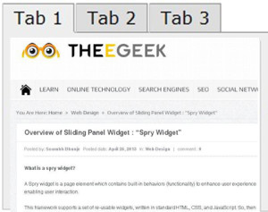
Overview of Sliding Panel Widget : “Spry Widget”
What is a spry widget?
A Spry widget is a page element which contains built-in behaviors (functionality) to enhance user experience by enabling user interaction.
This framework supports a set of re-usable widgets, written in standard HTML, CSS, and JavaScript. So, then style your widget as you want. Each widget is associated with the unique file. (CSS &JavaScript).
To style the widget, CSS is there and to provide functionality to your widget, JavaScript is there. Where you want to appear your widget, at that spot you must link these files.
Anatomy
This widget provides a ‘frame’ through which content is viewed and a content ‘panel’ which contains the page information. The panel is a block of content separated into discrete blocks or panels. When a user clicks on an element to show a specific block of content, the entire panel will move behind the frame until the selected content is in the window. You can use your widget with specific layout to move or slide your panels up, down or in diagonal.
Markup of the Sliding Panels widget:
Main widget element -This is the visible window element.
Sliding Panels container – This holds all the individual panels and can be any height or width.
Content Panel- Best that container size matches the visible window size.
Content Panel- As many content panels as you wish.
This widget is activated by a script tag below the markup that contains the widget constructor and its options. The Sliding Panels widget uses CSS to define the look and feel of the widget. coding style :
<style>
.SlidingPanels {
position: relative;
width: 100px;
height: 100px;
padding: 0px;
}
.SlidingPanelsGroup {
position: relative;
height:500px;
margin: 0px;
padding: 0px;
}
.SlidingPanelsContent {
width: 100%;
height:300px;
overflow: hidden;
margin: 0px;
padding: 0px;
}
</style>
<a href=”link” onclick=”spc.showPanel(0);”>Panel 1</a>
<a href=” link ” onclick=”spc.showPanel(1);”>Panel 2</a>
<a href=” link ” onclick=”spc.showPanel(2);”>Panel 3</a>
<div id=”Div1″ class=”SlidingPanels”>
<div class=”SlidingPanelsGroup”>
<div id=”firsts”>Content 1</div>
<div id=”seconds”>Content 2</div>
<div id=”thirds”>Content 3</div>
</div>
</div>
<script>
var spc = new Spry.Widget.SlidingPanels(“Div1”);
</script>
In this example, the <a> tags are used to change between panels. The showPanel behavior is used to select the panel. Spry uses a zero based counting system, so the first panel is ‘0’. There are options that can be set for the widget that control things like the duration of the sliding and the transition type.
Sliding Panel Widget Styling
To define look of spy widget, user should use CSS.
.SlidingPanels – This class goes on the outer container of the widget. This class sets the size of the visible window. Generally, you will want this window size to match your content container size.
.SlidingPanelsGroup – This class goes on the first inner tag that contains all the content panels. This class defines the size of the Sliding Panel. Setting the width, height and float of this panel will determine how the panel moves: horizontally, vertically or diagonally. Spry determines the shortest path to the chosen panel. Panels can be stacked horizontally, vertically or in a block of rows.
.SlidingPanelsContent – This class determines the size of the individual content panel. This should match the size of the visible window, but style however needed for the design.
For more reading about technology news in singapore and seo to online marketing do view more about other pages.
